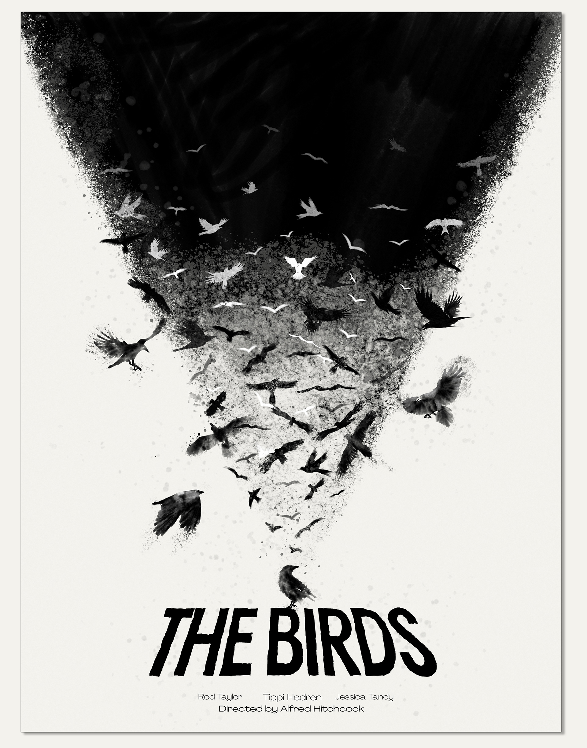
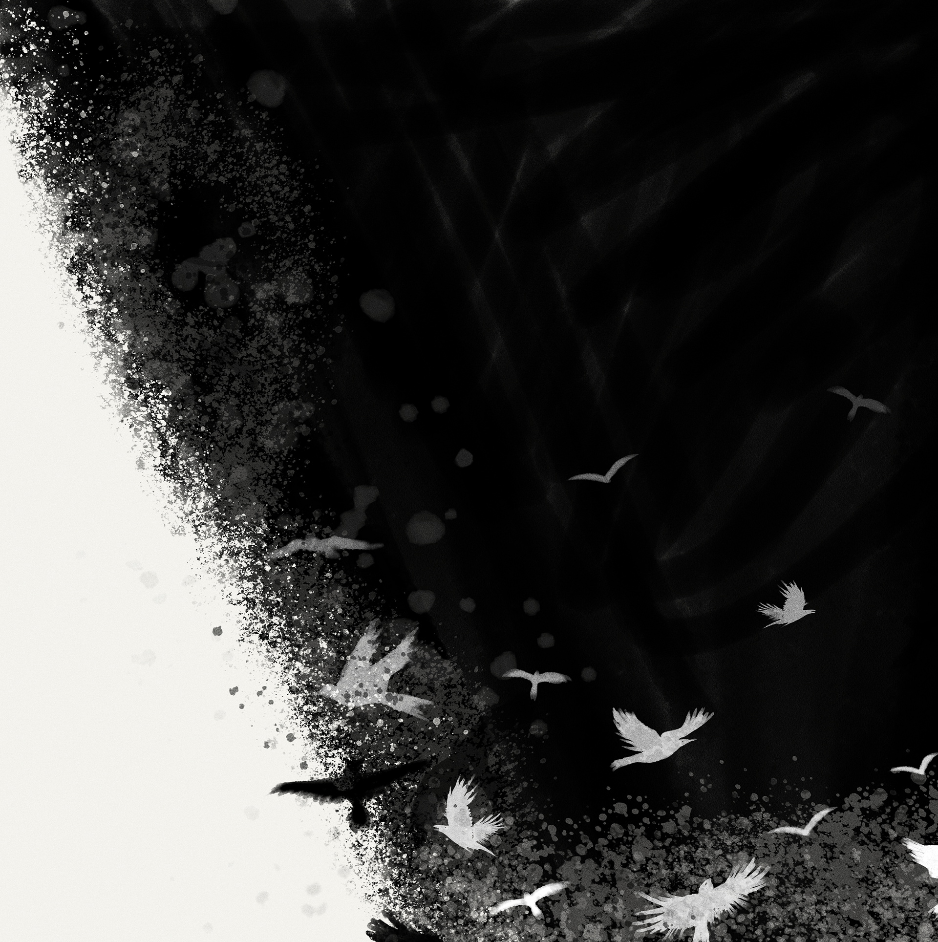
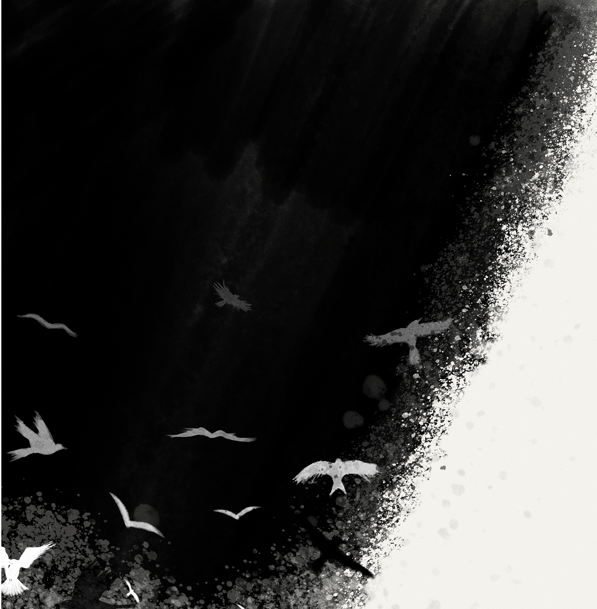
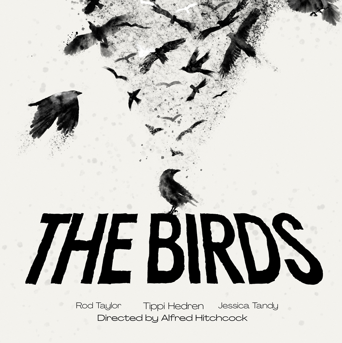
Making an alternative movie poster was something I always wanted, and "The Birds" by Alfred Hitchcock was a natural place to start. There are so many individual ideas I could extract from the movie so I decided to narrow it down to the birds only.
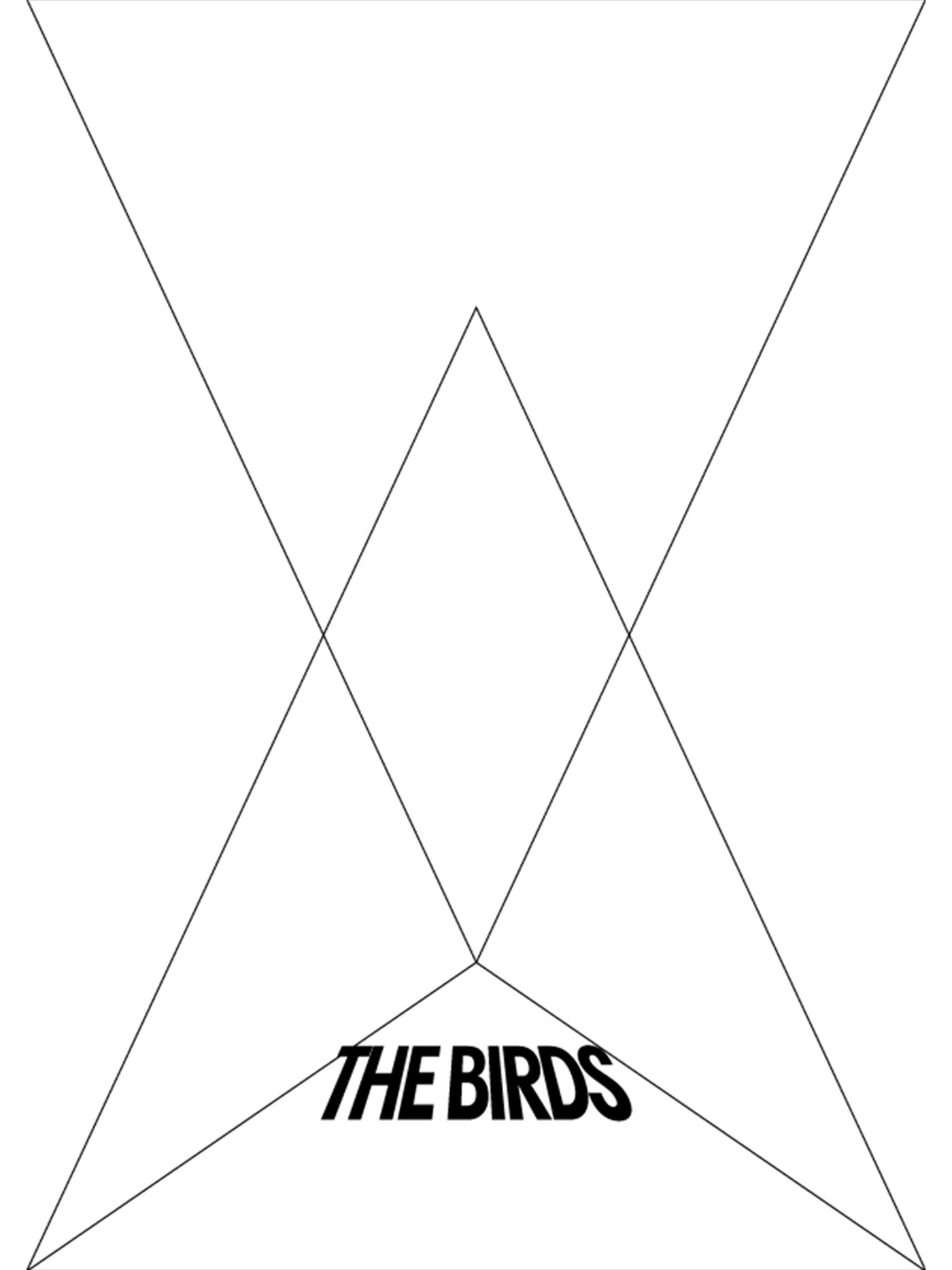
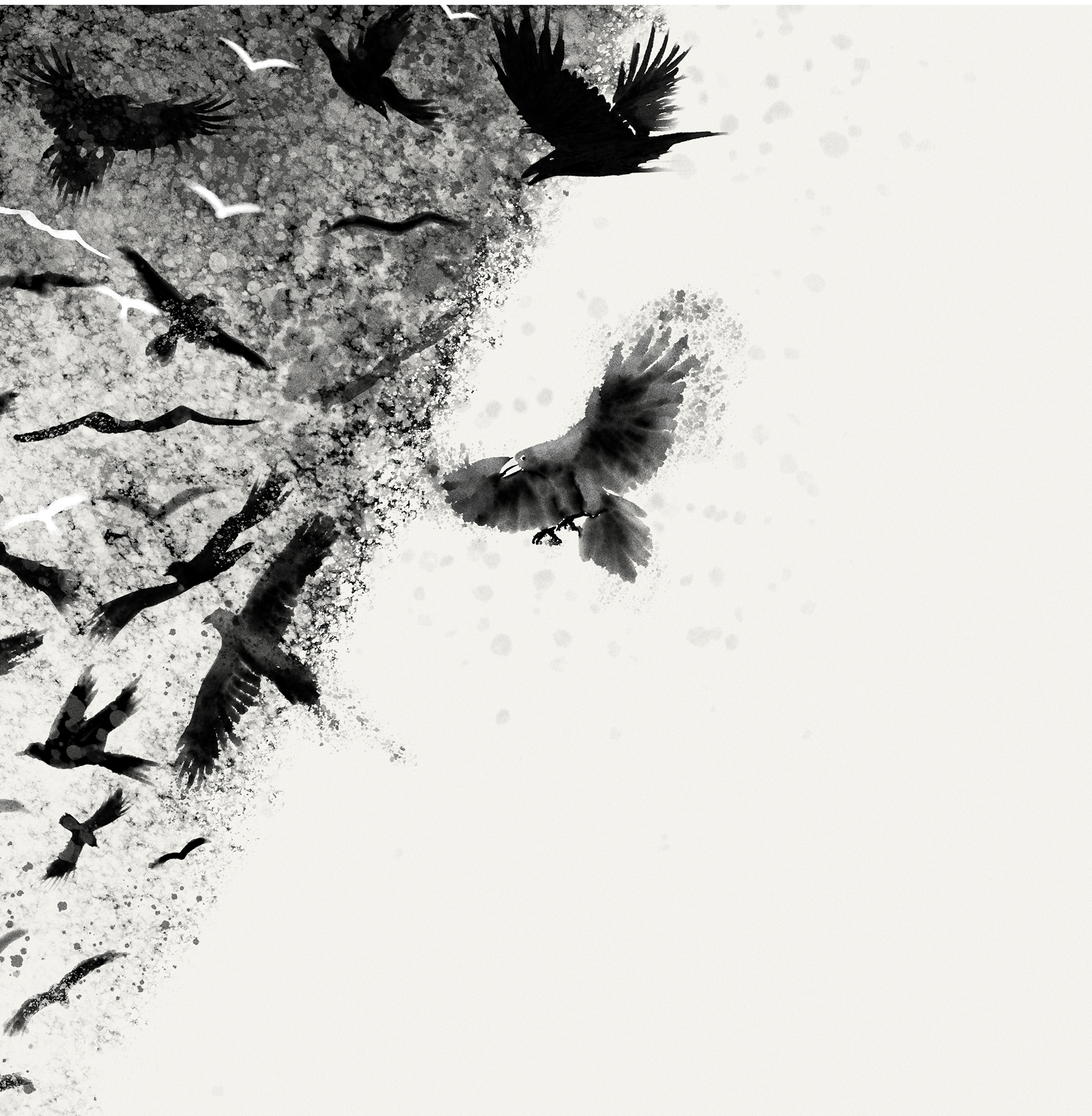
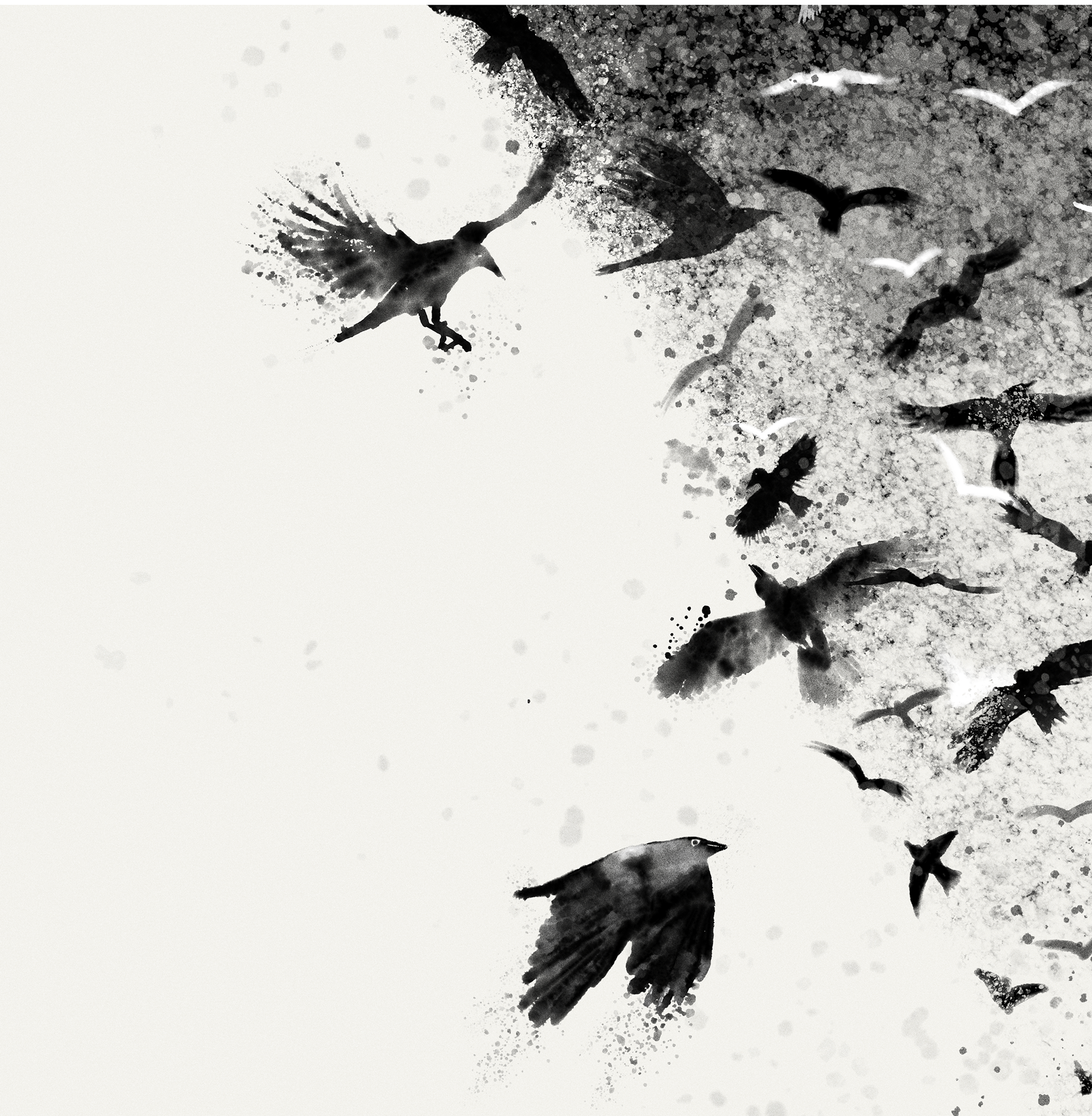
As usual, I started by drawing the composition and went through multiple iterations: I wanted to add the playground frames, and even Tippi Hedren running in the distance, but eventually I settled for a simpler composition, as the birds swarm I had in mind was detailed enough for me to work from.
It also complemented the use of a monochrome palette as well, concentrating on the watercolor, ink-wash effect, emphasizing the mood of the poster.
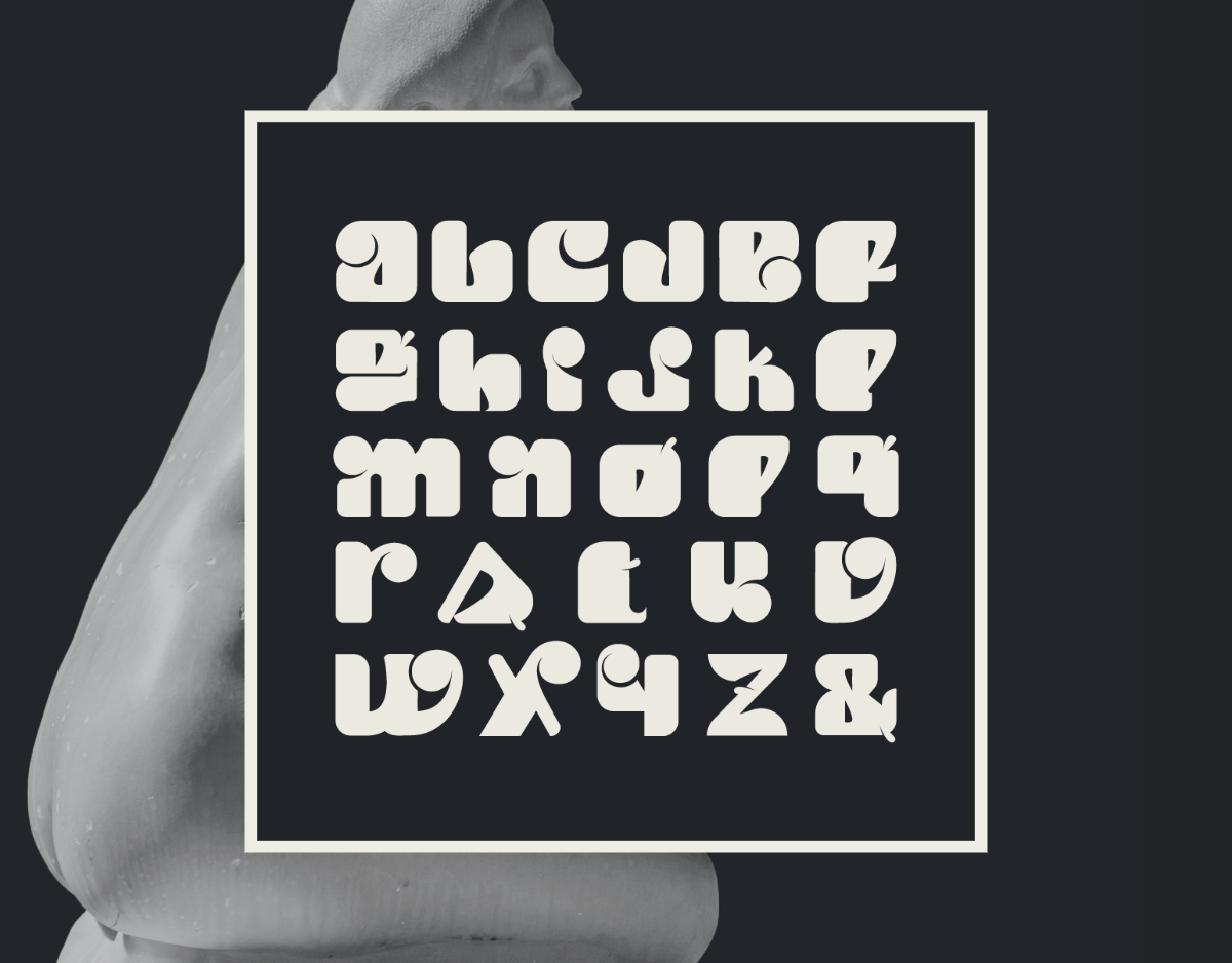
The fonts used are PP agrandir from @PangramPangram (wide light and grand regular) and the title is a custom font.
Drawn in Adobe Fresco using Kyle Webster's watercolor brushes and finished in Adobe Photoshop.
Here is a little process video, starting with sketches, painting individual birds, tfiller birds all done in Adobe Fresco (Ipad and desktop) and final compositing in photoshop.
Here are the preparatory sketches, as you can see, very rough. It was more about figuring out the composition.
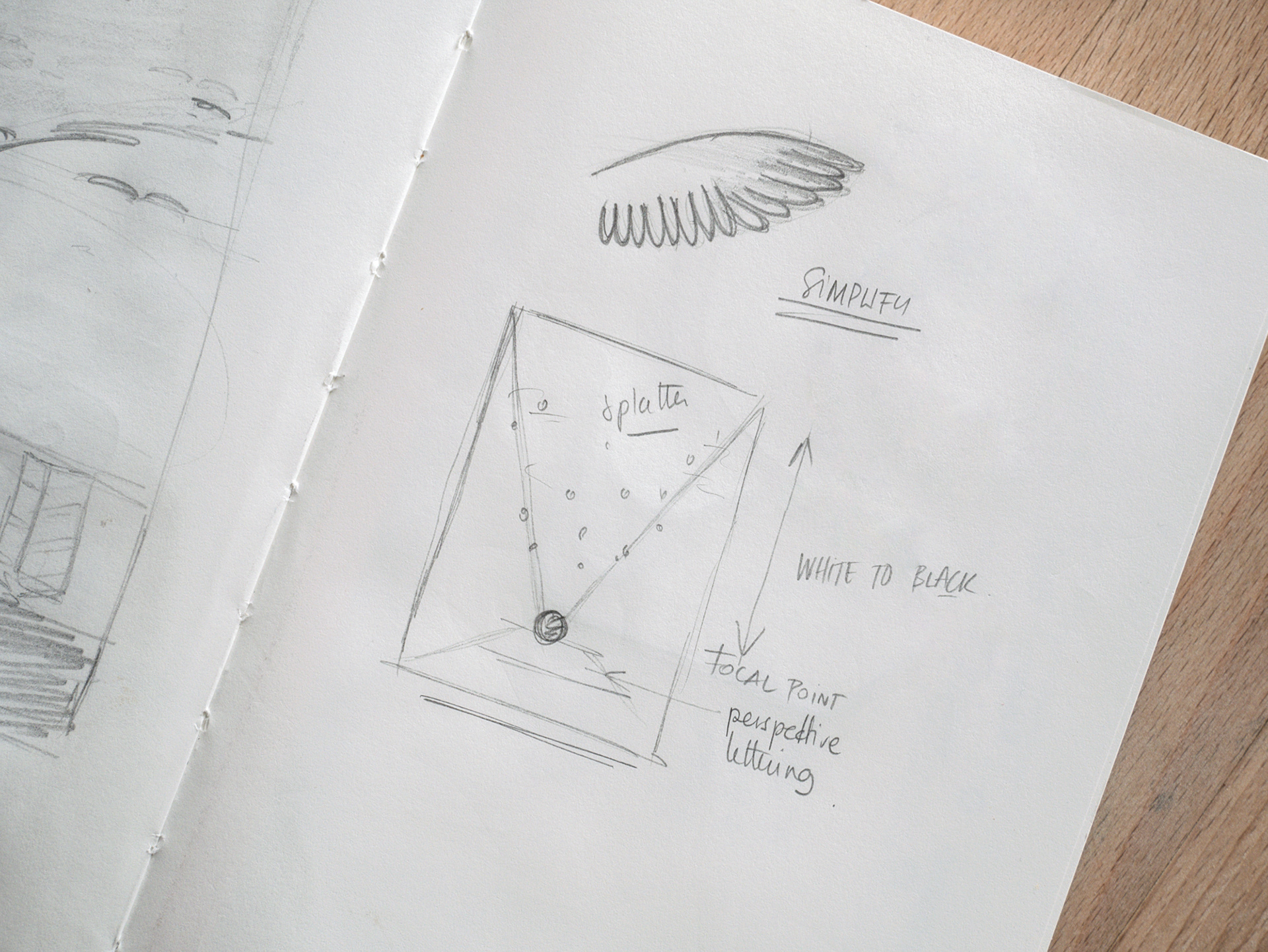
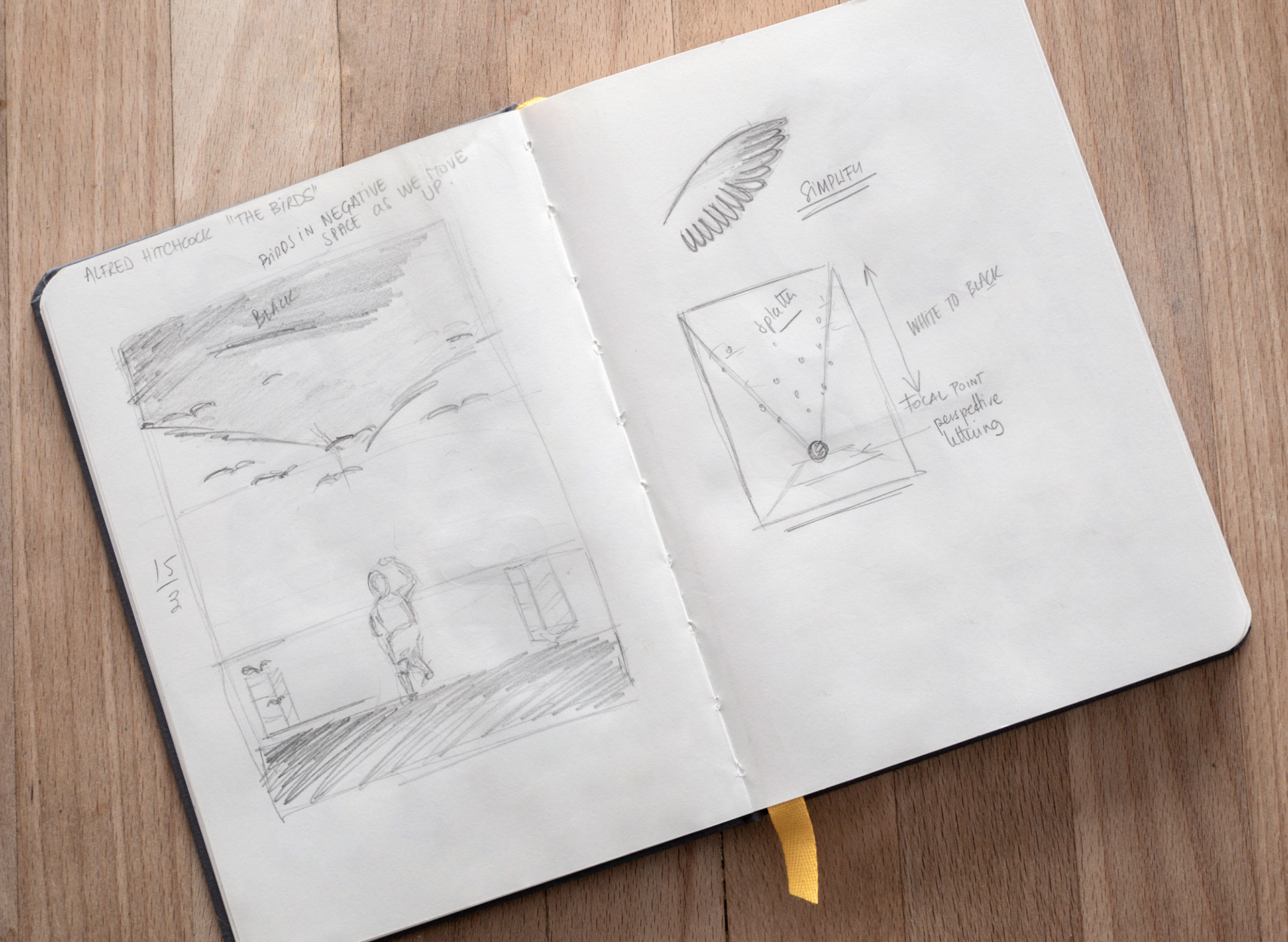
The general composition that served as a guide in photoshop for the compositing, putting the emphasis between the bird standing on the title and the crucifix-like white bird in the middle. Again, nothing too elaborate, as I wanted to balance the detailed aspect of the individual birds.