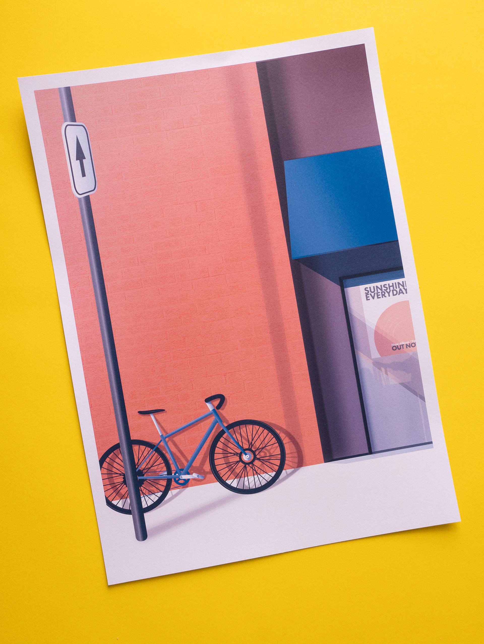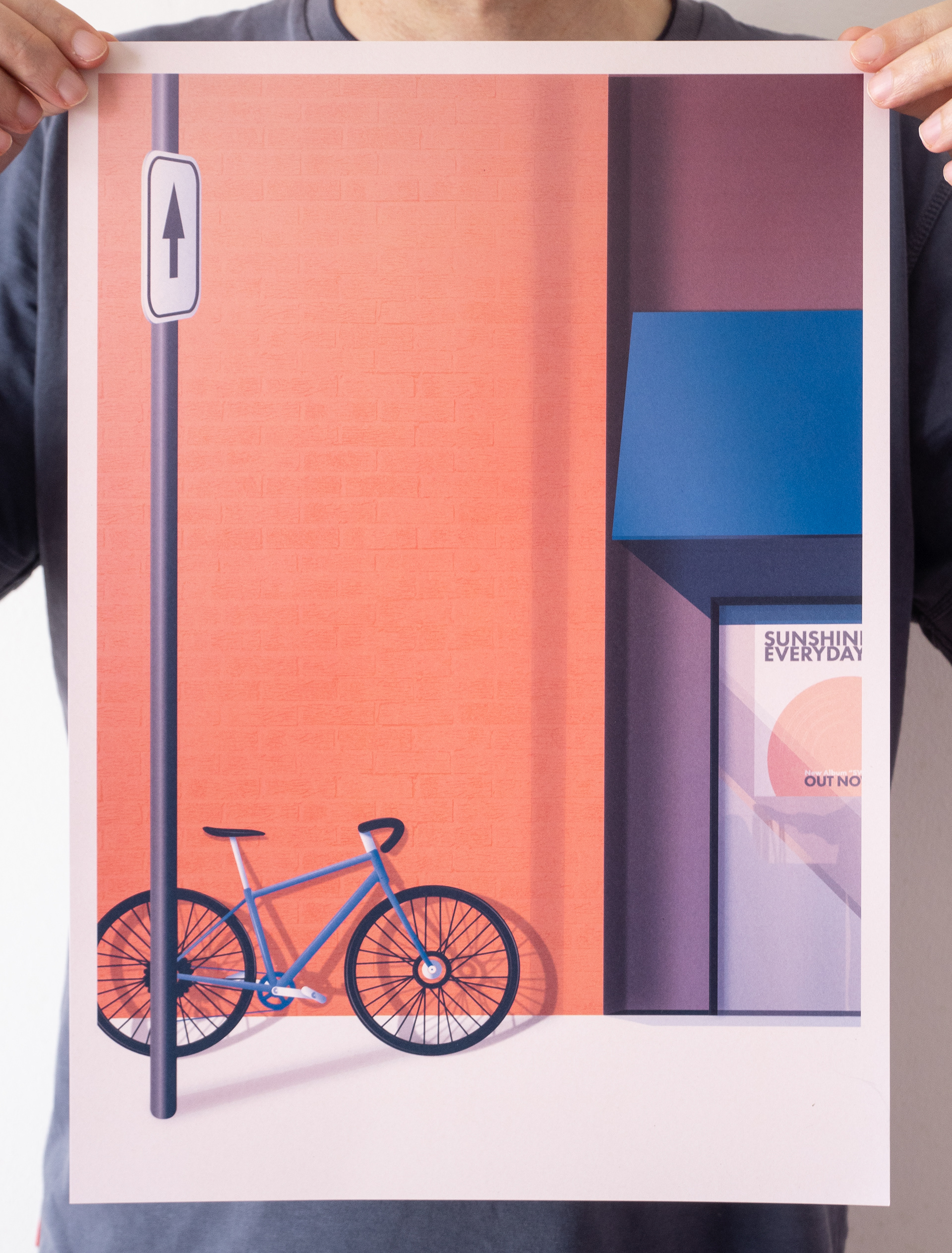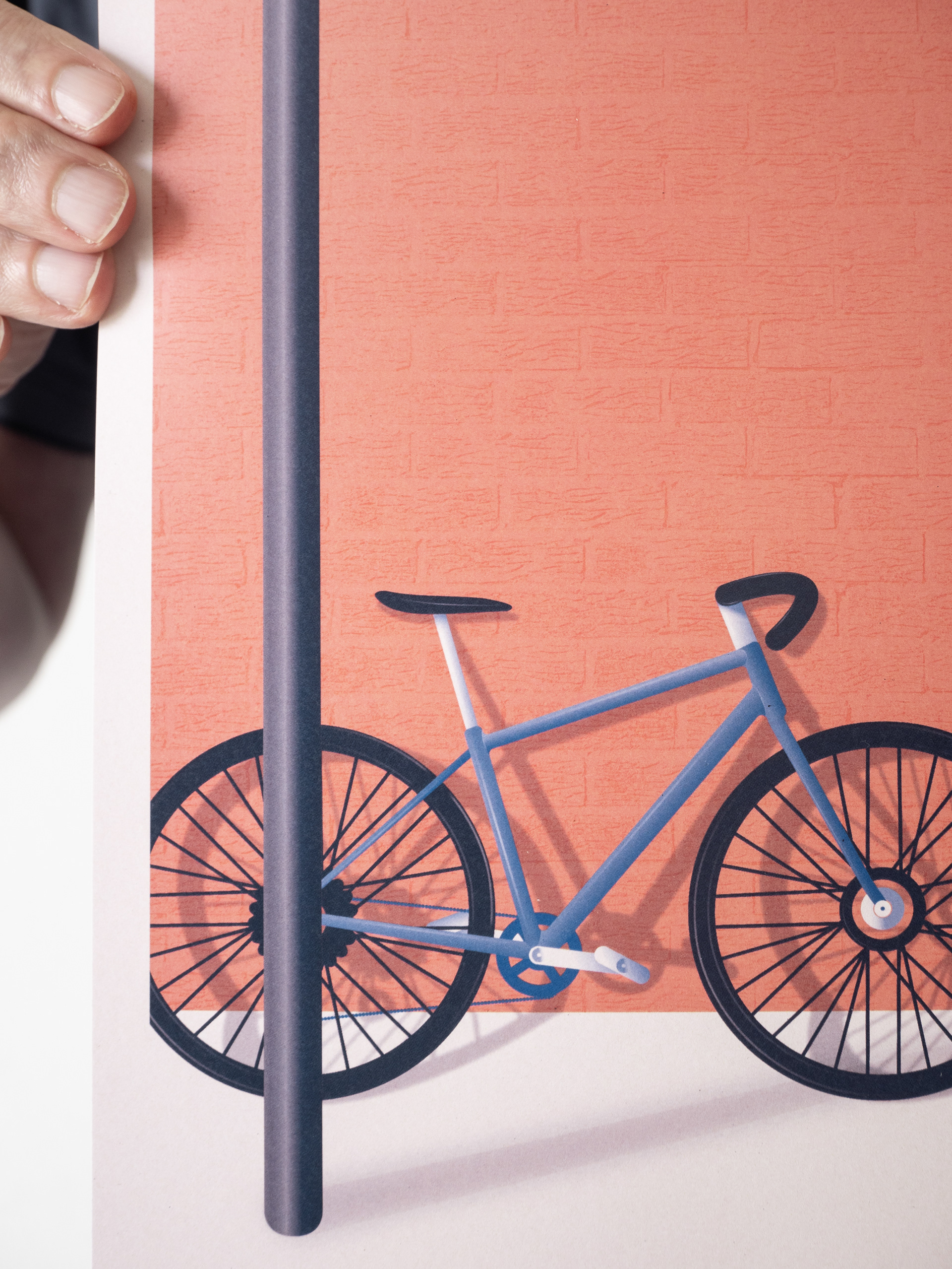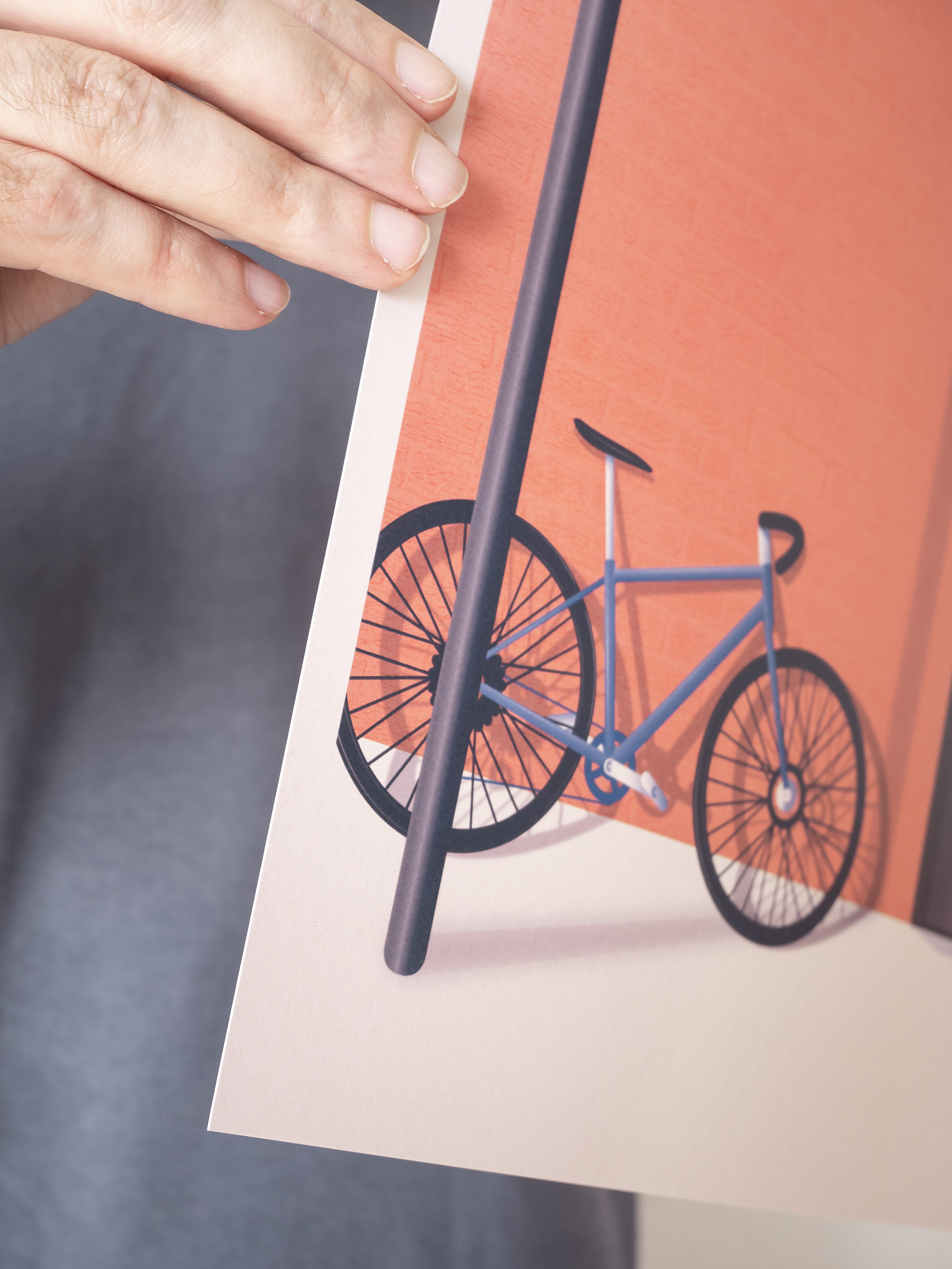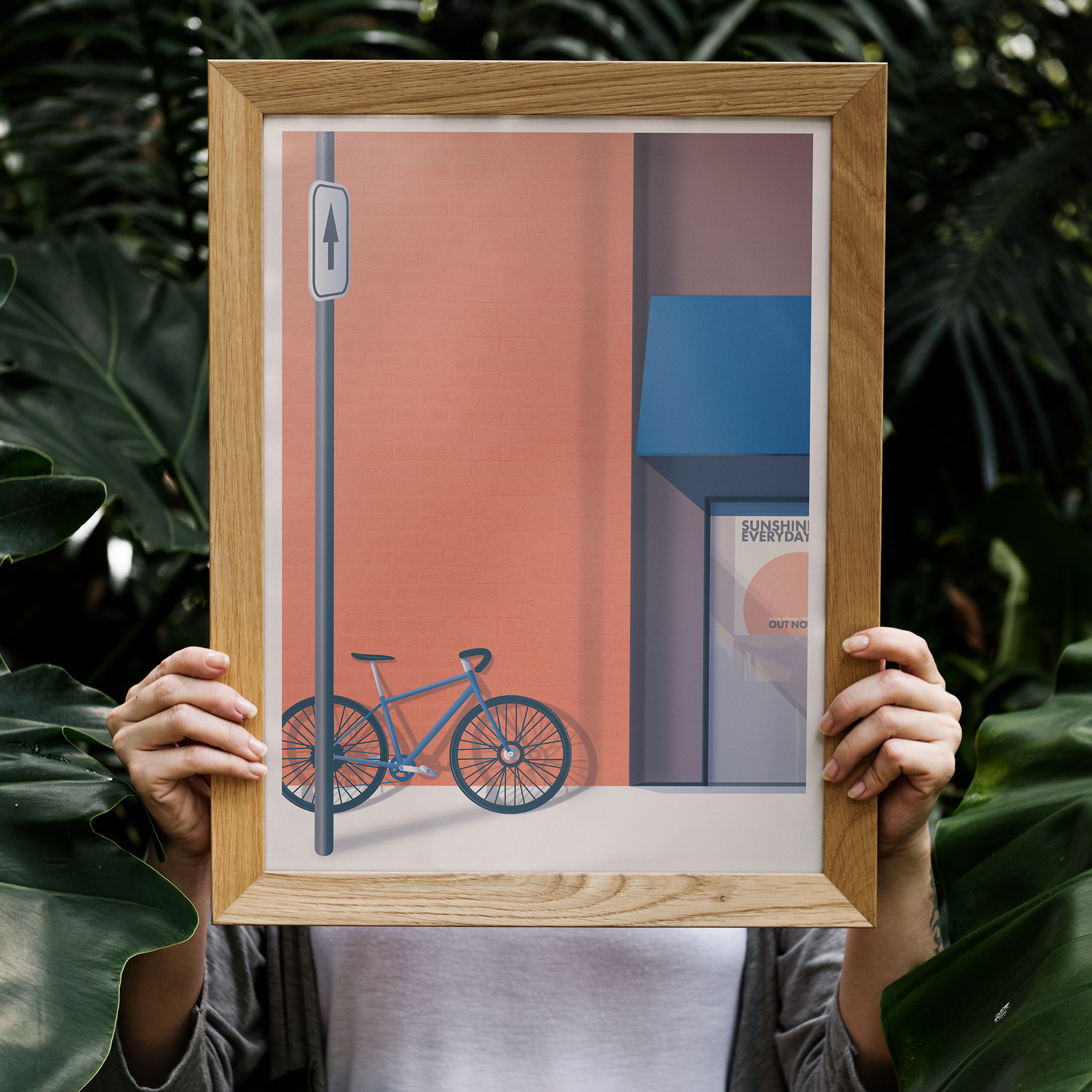

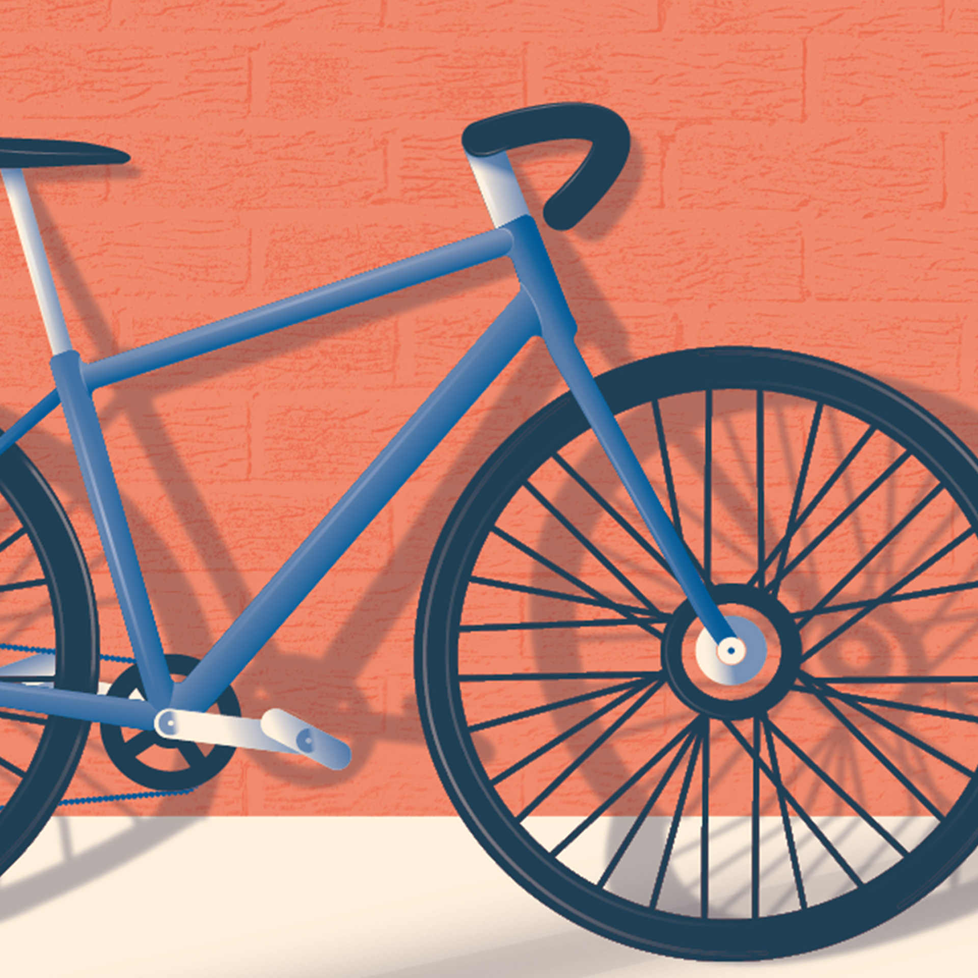
I decided to create a poster making use of a limited colour palette (2 colours + background ie: the paper). I decided upon a minimalist composition but with a fair amount of detail (highlights and shadows, gradients, textures), and making full use of the blending modes and overlays in order to create new tones from those 2 colours.
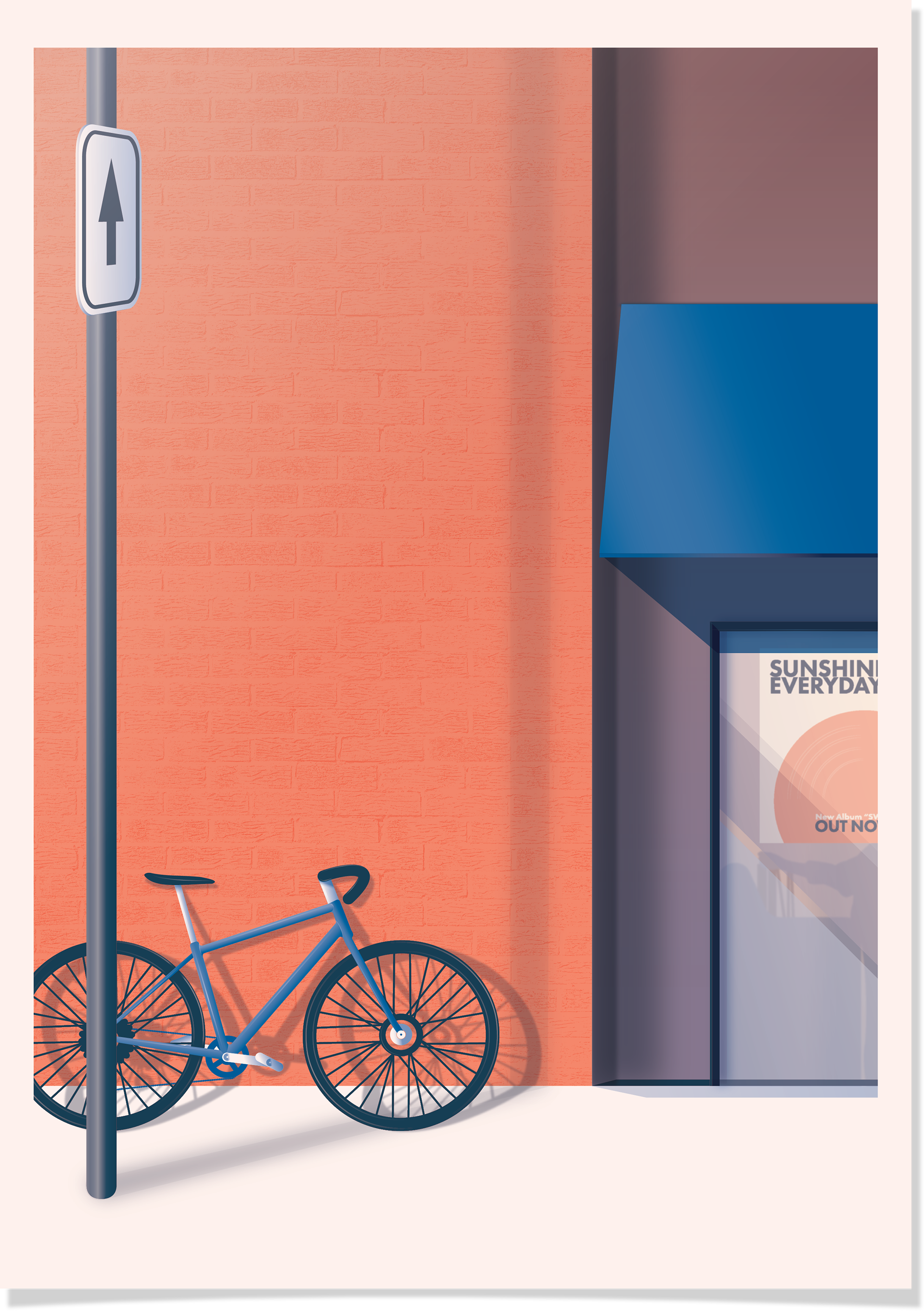
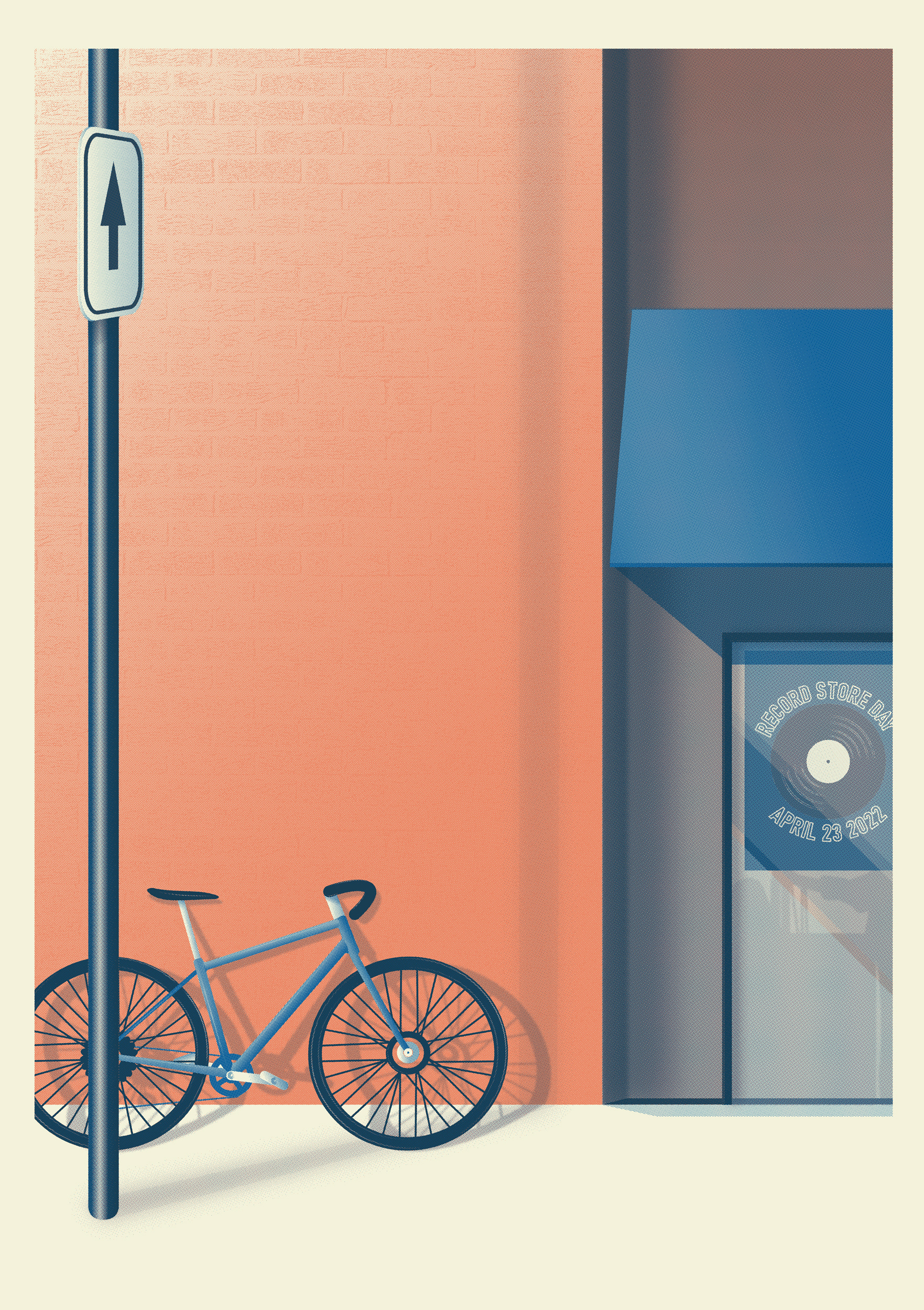
The backstory: The illustration is called "Sunshine everyday" and draws on mood of Californian sun and punk culture. It's an image I often have in my head of lazy bike rides in town, hopping from record shop to record shop on a pay-day. Sunshine everyday is also a song by the fantastic band "swell" (from the album "too many days without thinking") whose frontman David Freel sadly passed away back in April this year.
I started on the Ipad, with illustrator for mobile, just to put the elements together. I am prone to complexify my designs at the sketching stage, so, starting loosely on a smaller screen made me concentrate on the main elements. Of course, things tend to change during the course of the building up (such as removing the poster on the wall here)
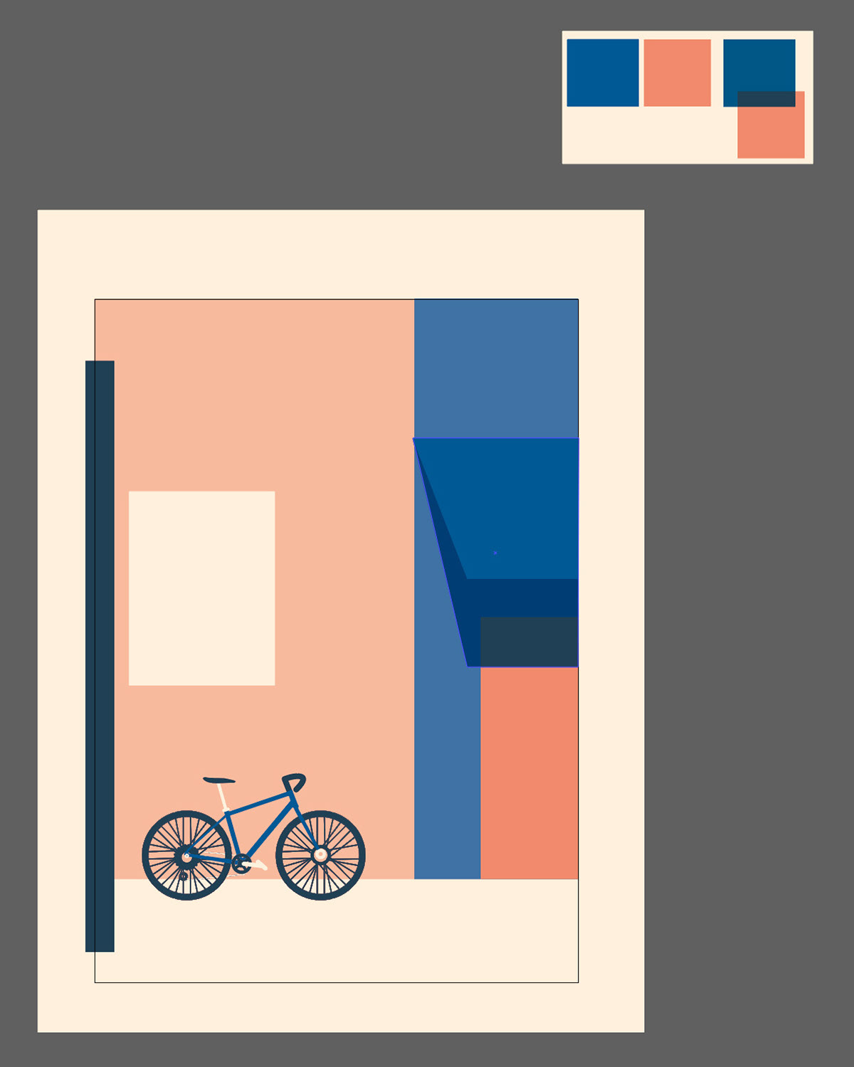
I then started to build from there on the desktop, adding details as I went along.
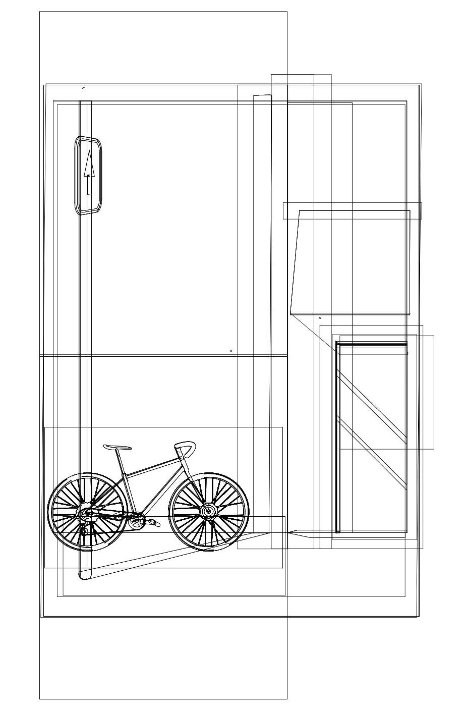
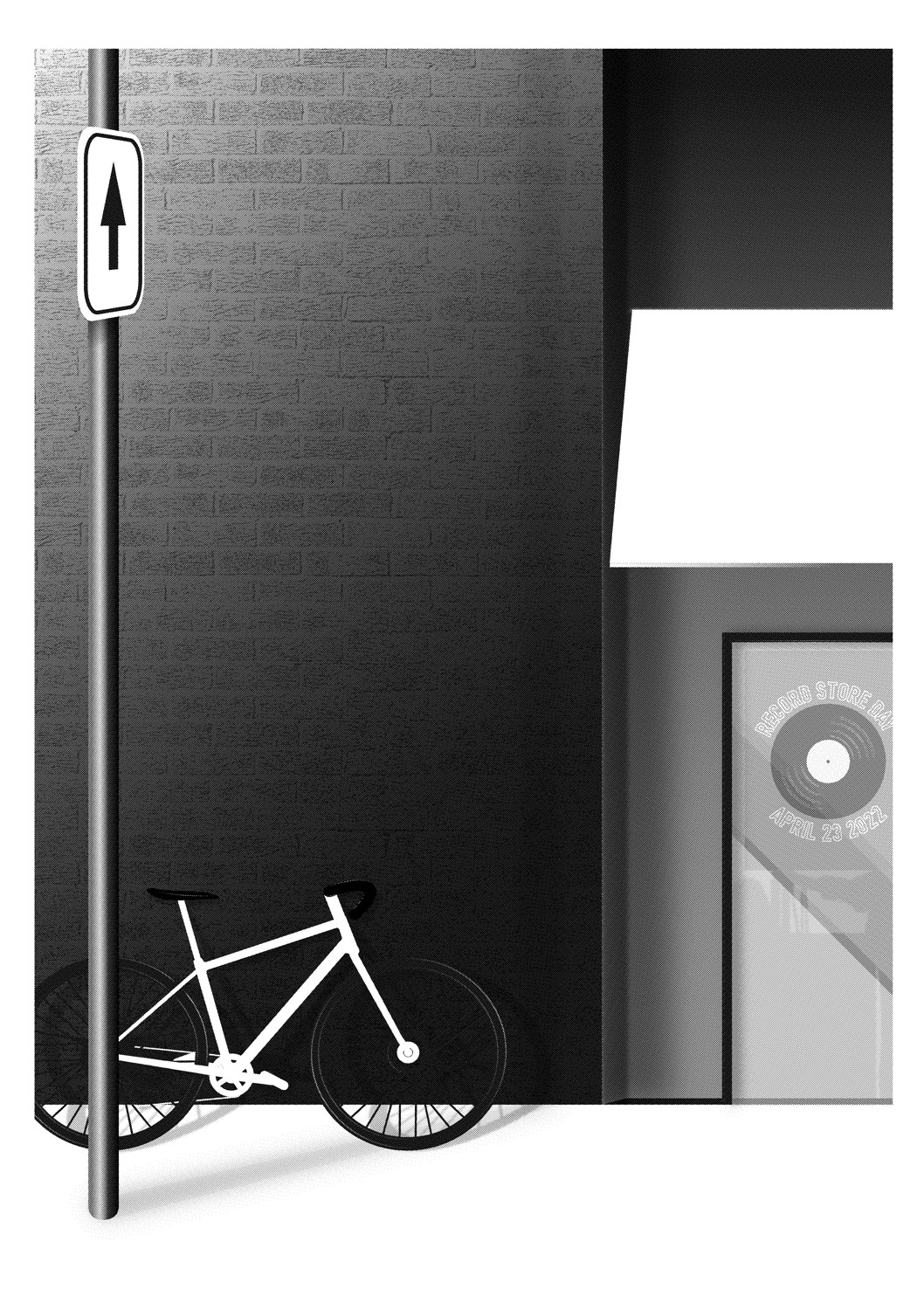
The outline view shows that the design remains relatively simple and all the leg work is done by the gradients and the texture.
The outline view shows that the design remains relatively simple and all the leg work is done by the gradients and the texture.
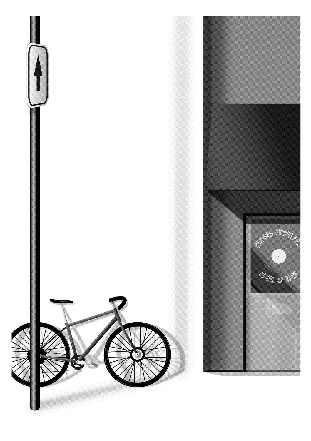
I made a first version for Record Store Day and practiced making separations for both Screen printing and Risography


The result of the halftoning in the screenprinting version.
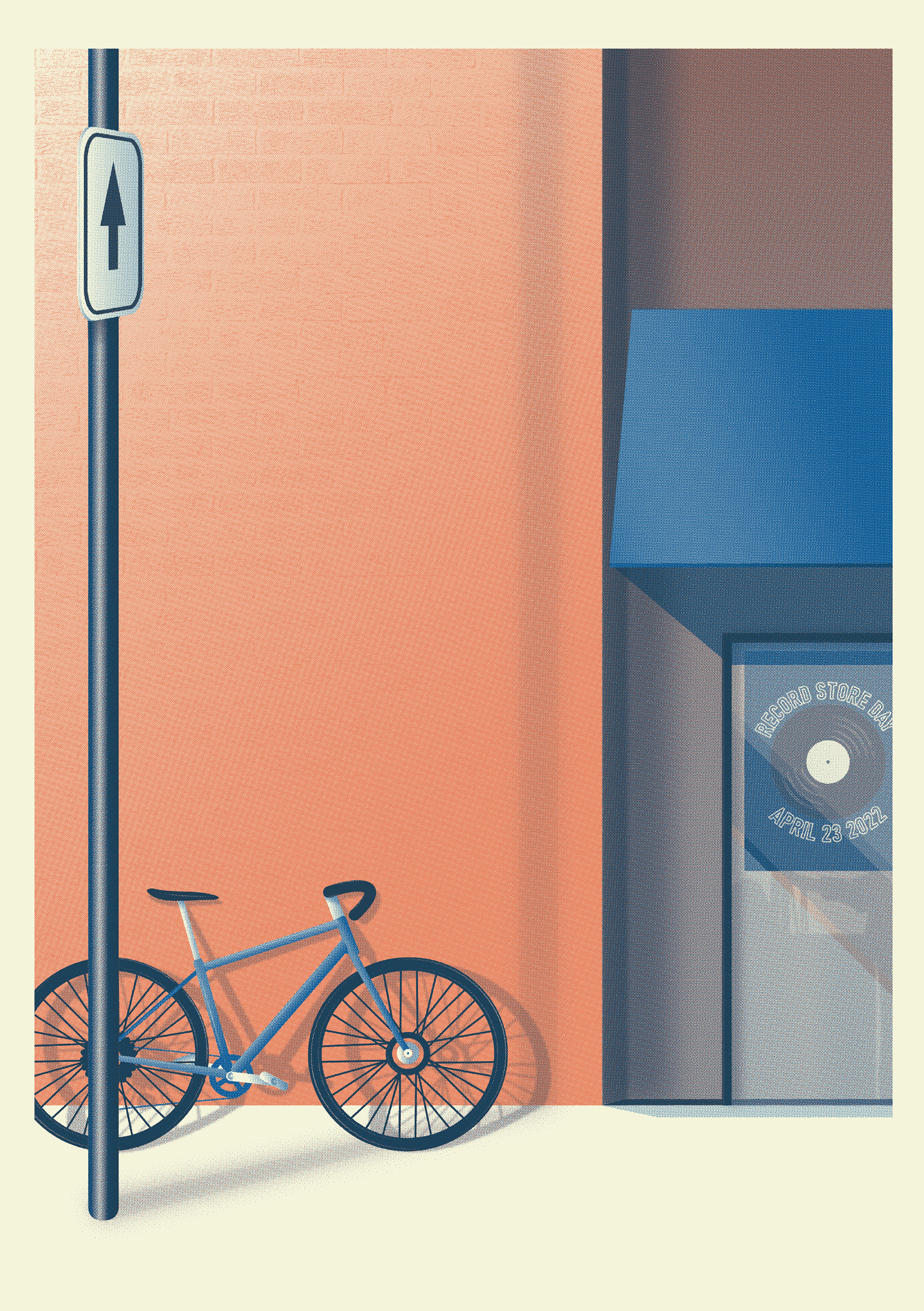
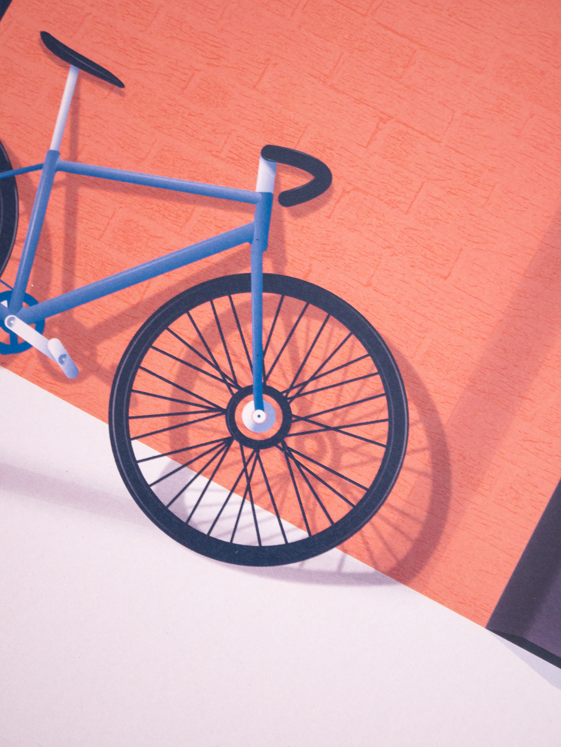
This is the texture I used for the wall. it's the external wall of my appartment block!

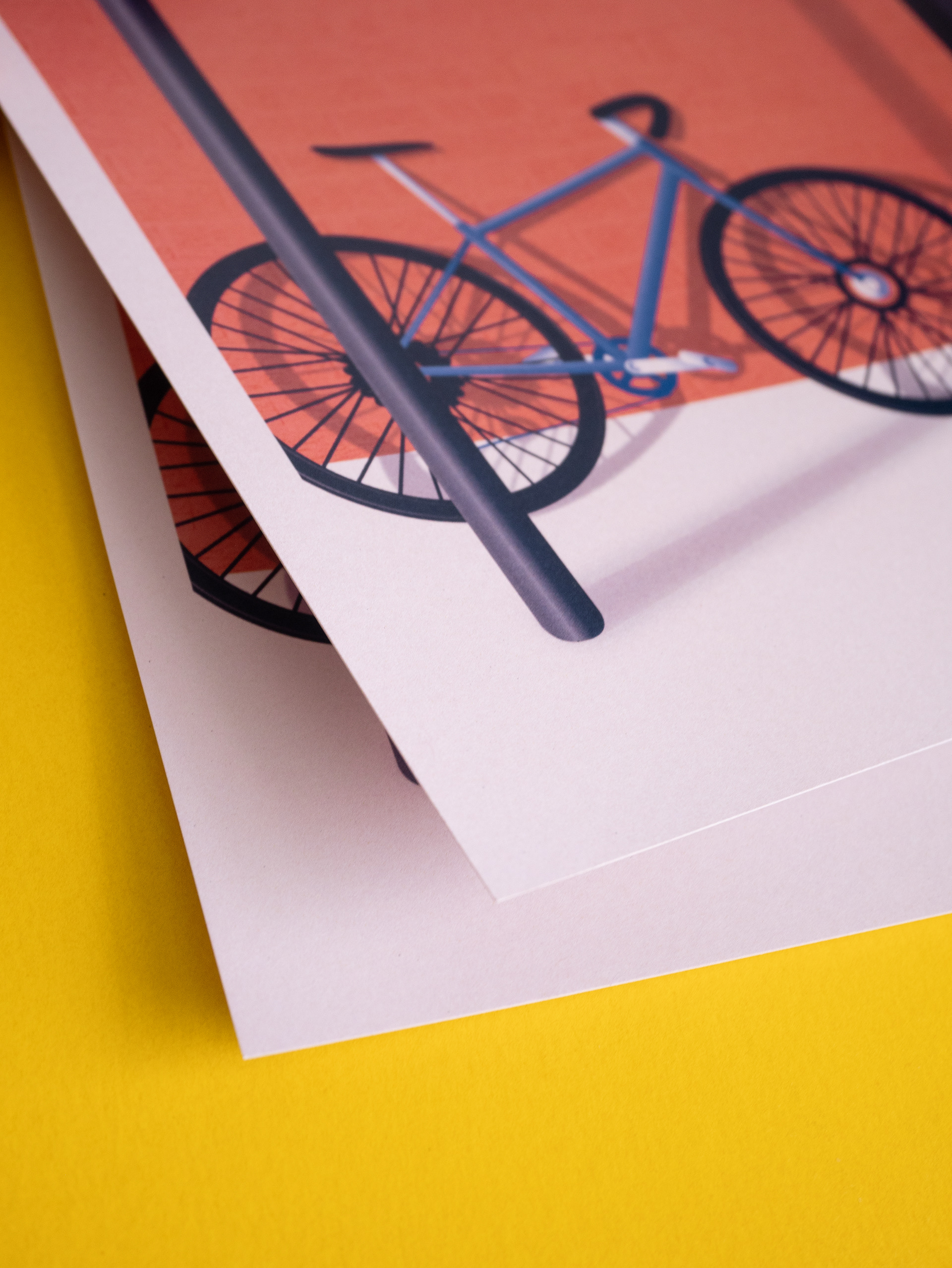
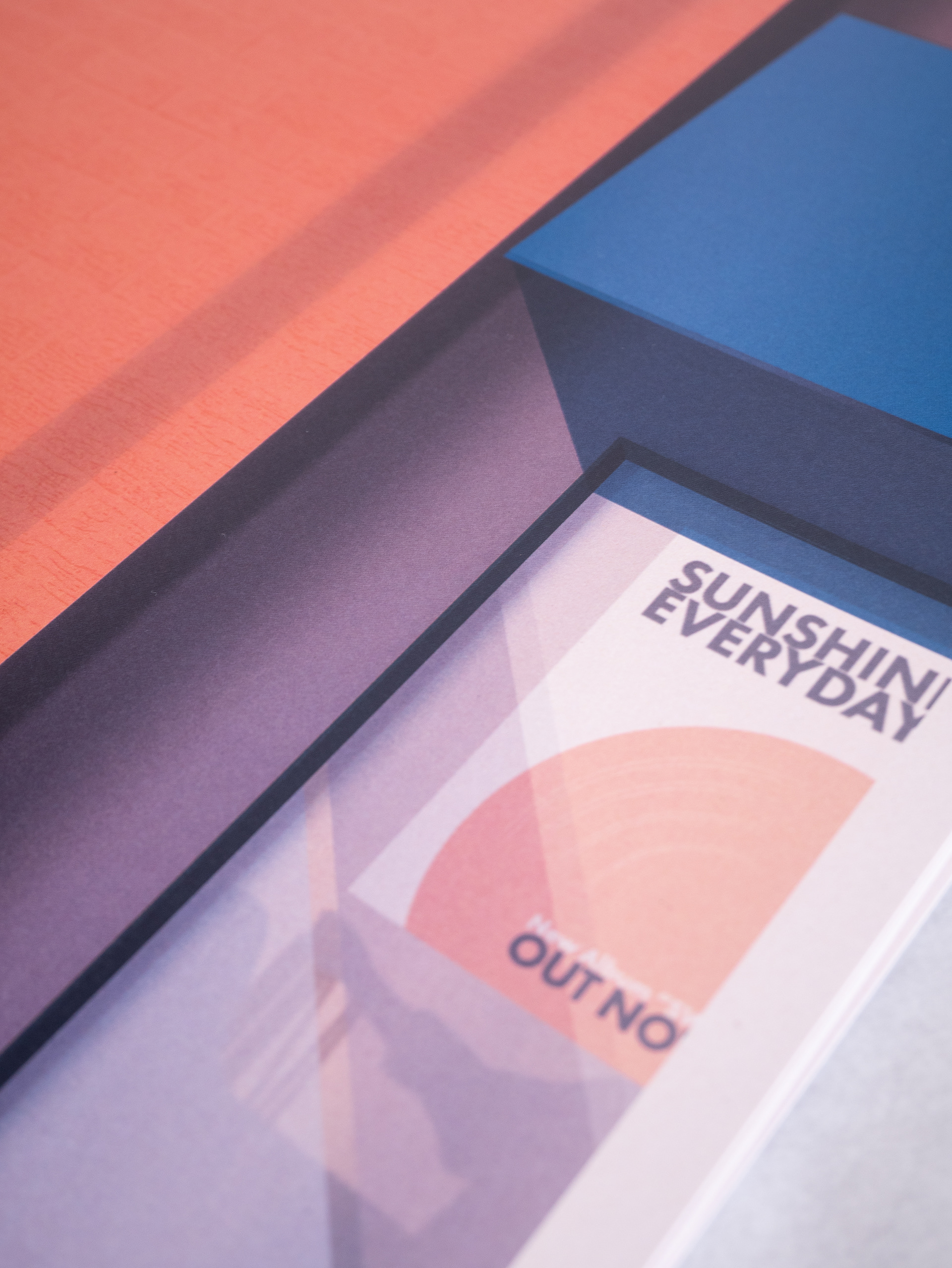
I eventually had it printed as A3 heavy weight art prints (300 gsm on recycled paper)